Posts

Trailer 2 Filming and Editing
Image
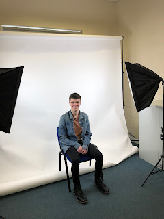
I wanted my second trailer to be an interview with cutaways. Filming the interview I used a white screen and three point lighting ( two softboxes and a ceiling light). I used three point lighting and  a white screen in order to create a professional looking interview room and to give weight to the premise of the show.  I shot the interview using different camera angles ( from the front and from the side ) but I always used a slightly lower angle to give the character a constant sense of power over the room reflecting his power within the show as the leader of the hunters. I gave the character the name of David Horatio as it sounds both powerful and that he is from a high social class ( also reflected in his police ranking as Sergeant) as I wanted to represent someone from an upper class background. This is also reflected in the way he speaks using complex words such as "plethora" meaning to have an excessive amount of something. After the interview I cut

shot list for trailer 1

Image

trailer 1 filming and editing

We filmed the trailer in the afternoon. We used the Ronin stabiliser  to make sure the shots remained smooth. For some other shots I used a telephoto lens. using the lens I climbed up a slope parallel to the footpath to get a shot looking down on the chase with a narrower field of view so give a sense that the hunter was closing in on the runner. I also used the telephoto lens to create a shallow depth of field for the shot of the footpath sign and the runner (out of focus) passing by it. The sign helps orientate the viewer to the direction he his headed. The next shot of the runner jumping through the window is my favourite shot as it follows him through the building and down the track, the full shot lasts until the car drives away but I had to make several cuts to the shot in order to fit the 30 second mark as well as cutting away a bit of faffing about when the runner tried to get into the car. When I edited the trailer together I used the theme Don Abandons Alice from the film 28

location ideas and scouting for trailer one

Image
For trailer one I am creating a chase scene between a runner and a hunter. For this I wanted to film in a woods or abandoned factory. Several places came to mind when I began to plan out filming this trailer. The first place I considered was an abandoned factory in matlock bath which I could get access to as I know the owner. However this plan fell through as the factory was demolished at the start of the year to help strengthen the riverbank as the railway line runs above it. My next idea was Stanton In The Peak and the forest above it. I chose Stanton in the peak for it's abandoned quarry which lies along a footpath. Once I had scouted the location I drew up a shot-list for my trailer to follow. The main shot I wanted to focus on was a long shot which follows the runner as he runs through the remains of a building to gain some distance from the hunters before getting to his escape vehicle. This is the main shot that I wanted to focus on. The plan is to use a DJI Ronin to keep

OCR Reality TV Advert Initial Ideas

Initial Idea - On The Run My initial idea is to create adverts for a reality TV show where contestants have to make it from Abbots Bromley to  Halifax on foot ( with one use of a 10 mile lift in a car) without access to gps technology or modern technology, only OS maps and a compass, which is a distance of almost exactly 100km (100.2km) , whilst being tracked down by a team of chasers who have access to high tech equipment in order to track them down. They have 4 days to make it to Halifax however they are only allowed to travel on foot with one use of a ten mile pick up by a car at any point (however an hour later the chasers will be notified of this and the drop off location)  whilst the chasers can utilise vehicles to close the distance on the runners. The two points have been chosen as it takes the runners through the Peak District if they are to go in a straight line. Each episode will be an hour long and focuses on a different set of runners trying to make it to Halifax ( 2

What A Surprise!

Image
My next task was to create a short video which showed someone giving someone a gift which causes them to exclaim " what a surprise!" The video had to begin with the character who gives the gift entering the room. I wanted to learn how to use a 3-axis stabiliser and i saw this as the perfect opportunity to do so. My aim at the start was to create a long take of the gift giver walking down the stairs and through a corridor. It took a few tries to get used to the stabiliser but after a few takes I managed to get the shot I desired. I had pre-written the script with my group the day before so we had a plan of action. Once the two people began talking I used a shot- reverse shot to film the conversation making sure to use the 180 degree rule as to not disorientate the viewer. To create the effect of the book appearing in the gift givers hand we used two shots (one with the book and one without) and then merged then to gather using the flash transition, to make it appear as if

Cutting down an advert to 1 minute

Image
I was tasked with cutting down a John Lewis Home Insurance advert down from 1 minute 35 seconds to 1 minute. To do this I removed part of the living room down and started by cutting to the Hallway scene. To make this flow with the opening of the dad washing the dishes I created an eye-line match of the dad looking at the hallway and then I cut to the camera tracking the girl down the hallway to create an eye-line match. The after the girl finishes jumping on the sofa I used a graphic match to cut back to a part in an earlier scene in the original advert where she jumps off a footrest. I cut it so as the girl went to land off the sofa it cuts to her landing after jumping off the footrest. This makes the cut seem less obvious and keeps the video flowing. To make the ending less jarring I put the slogan after the companies logo. this is because the cut between the girl dancing with plant to the shot of glass wobbling with the logo is less jarring and fits better than the scene